Mobile Phone Electronic Bills: Let's Make It Easier Not to Look at the Detail
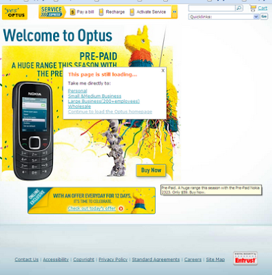
CONTEXT: Optus is my mobile phone provider. As of the time of writing, Optus has effectively put its customers on electronic billing. That is to say, you have to pay a fee to receive a paper bill. Customers receive an email notification that sets out the total amount owed. In order to view the full bill, the customer needs to log on to a website. The link to view the full bill provided in the email notification is not the link to the log-in page. Rather it is a link to the Optus home page. Once on the home page, it takes several links to get to the log-in screen. The navigation is not entirely clear. My browser (Google Chrome) did not work with the site.
IMPLICATIONS: This system increases traffic to their website where Optus can present advertising and cross-promote. It also creates a disincentive for customers to view their detailed bill. Decreased viewing of the bill decreases the awareness that people have about how their usage relates to their bill. This in turn increases the likelihood that customers will use their phone in less optimal ways given the payment structure.
WHAT SHOULD BE DONE: Optus should not put such impediments in the way of bill access. The bill could be provided as an attachment in the email or the link could go directly to the log-in page.
Example Bill Notification Email
The page you get when you follow the link www.optus.com.au (8/12/2009):
iTunes Synchronisation: If you want to Synchronise, you must see iTunes
CONTEXT: When users synchronise their phones with iTunes, iTunes opens a window on the computer. It is not possible to let iTunes synchronise silently in the system tray. Once synchronisation is complete, iTunes remains open.
IMPLICATIONS: Users are less likely to synchronise because of the disruption it causes. Users are more likely to go to the iTunes store because it is put in their face more regularly. In short, the result is less synchronised individuals and more profit for Apple.
WHAT SHOULD BE DONE: There should be an option in the iTunes interface that allows for a background sync. This could involve simply an icon in the system tray.
iPhone Apps Store Defaults: To see Free, You Must See Paid
CONTEXT: At the time of writing the first screen shown in the Apple Apps Store on the iPhone is that for Paid Apps as opposed to Free Apps. I have seen no option to change to the default to Free. There is no option to hide all paid apps. In order to install free apps, you need to have an account.
IMPLICATIONS: This increases the likelhood that a person will buy paid Apps, and thus more profit for Apple.
WHAT SHOULD BE DONE: The default should be free Apps or at least the default should be whatever was viewed last. It might be good to have an option to hide paid Apps.
Example of the default display (Top Paid) on iPhone (8/12/2009)
Unsubscribing from an Email: If It's a Hassle to Unsubscribe, More People Wont
CONTEXT: I sometimes attend events at the Arts Centre. As a result of this, I was put on an emailing list. This did not bother me too much, but I did not want to receive such emails. Thus, I clicked the unsubscribe button at the bottom of the email. This took me to a website that informed me that in order to change my settings that I would need to log-in to the website. I'd never used the website. Thus, how is it that I would even have a log-in. After some thinking, I noticed in the email that they had provided me with a login and password. Thus, in order to unsubscribe from the email, I had to locate the log-in information and then enter this into the website and then select unsubscribe.
IMPLICATIONS: The harder it is to unsubscribe from an email subscription, the less likely it is that someone wanting to unsubscribe will unsubscribe.
WHAT SHOULD BE DONE: Unsubscribing should be a one-click solution. When I made this suggestion to the Arts Centre, they said that they required log-in to prevent others unsubscribing on their behalf. Do such maliscious people exist? I then suggested that it would be possible to have something unique in the email that allowed the individual to unsubscribe only if they had receive that email. I received no reply.
Concluding Thoughts
Note that I like my Optus phone plan, my iPhone, and attending events at the Arts Centre. They're great. However, I don't like the systems that these companies have set up.
All these dark nudges have something in common. They blend sneakiness with poor usability. They are sneaky because they are subtle; the customer's loss is the company's gain. Also, the behaviours can all hypothetically be attributed to poor usability as opposed to maliciousness.They allow the company to make excuses along the lines of: "we're not trying to manipulate customers, that's just how our system works".
The degree to which companies feel that these are beneficial is contingent on the extent to which customers notice and get annoyed with such practices, and ultimately whether customers change their purchasing behaviour because of them.
Ultimately, it's not the personal inconvenience of these nudges that bothers me. It's the fact that a company is adopting policies where these little inconveniences are multiplied over thousands or in some cases millions of customers.


